One Green. One Gold. One Brand.
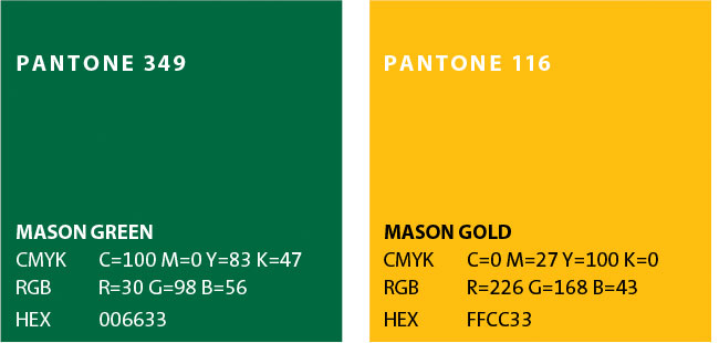
Mason green and Mason gold are the primary colors of the university’s visual identity program. Mason green and gold are the heart and soul of who we are and play a clear and powerful role in anchoring the George Mason University brand.
Using the Primary Palette: Signature Colors
The primary university colors help us define what is distinctive about our brand. They are a powerful differentiator that lets us stand out from other universities. The colors play a prominent role in introducing the university to prospective students, building a sense of community and campus pride among current students, and connecting or reconnecting to our alumni and friends. Using this palette appropriately and consistently creates an additional level of distinction by building or strengthening our relationship with our constituents.
- Mason Green is a cool color that can represent nature, prosperity, renewal, growth, calm, and strength. Many of these attributes tie in with the themes and tone of the wording in the Message Map. The color may be used for either large areas of color or as an accent color.
- Mason Gold is a very bold warm color that can represent optimism, enthusiasm, fun, clarity, and confidence — again many of the attributes described in the message map. Because it is such a dominant color, with few exceptions, a little Mason Gold goes a long way. The color is very effective used solely or with Mason green on publications and merchandise targeted at enhancing school spirit. Otherwise, it should be used primarily as an accent color and, with very rare exception, never as a type color.
Many universities manage their brand by limiting color use to school colors only or school colors with a few complementary colors. Our visual identity program recognizes that institutionally it’s not in our DNA to take an approach that limits the expression of who we are. Instead, we have developed a set of secondary colors that can be used in combination with our primary colors to express the many facets of Mason. Perceived appropriateness may help you select among the secondary color palettes (selection based on “fit” to message), or your target audience and message may drive the decision on which palette to choose.
Secondary Palette: Universal Supporting Colors
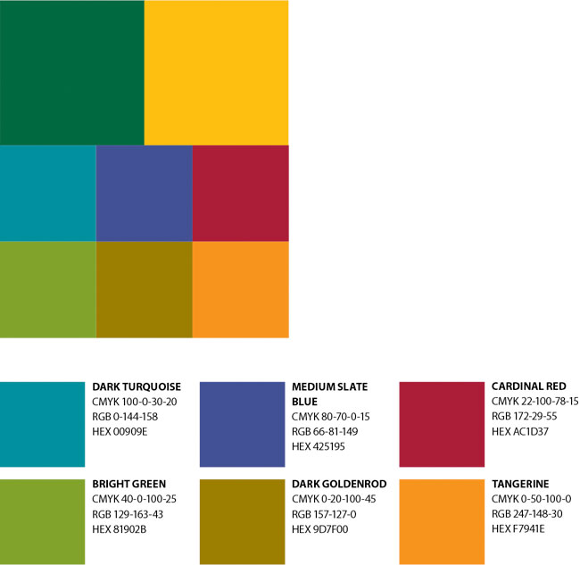
The colors in this supporting palette were chosen to complement our primary palette of green and gold, providing additional range to the brand experience.
The secondary palette colors work well as accent colors or as subtle backgrounds behind typography or graphics. Darker colors may be used behind light-colored typography. Screens or tints of the supporting colors may be used to achieve the desired effect but should be used cautiously, as screening certain colors may result in undesirable pastels.
The colors in this palette were selected to be universal in nature and can be used in most any project, independent of target audience such as
- Department newsletter
- Degree program brochure
- Fact sheets and announcements
Secondary Palette: Deep Jewel Tones
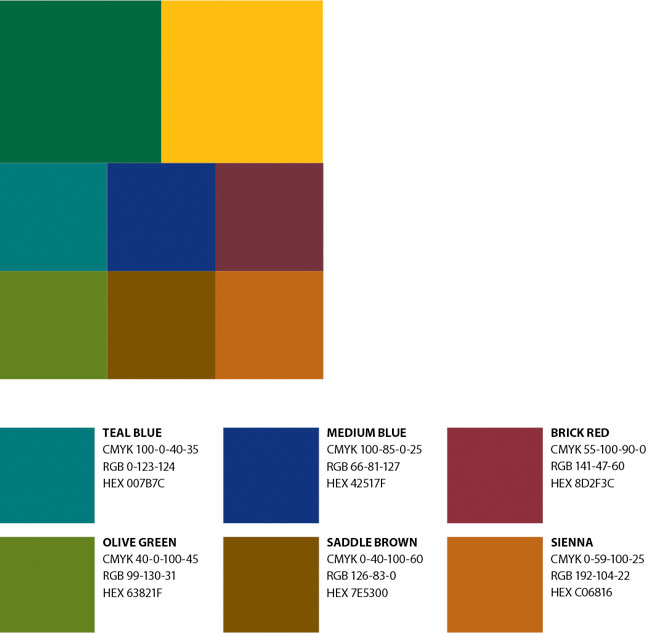
The colors in this palette are a deeper version of the colors in the supporting palette. These are richer and more saturated colors that still work very well with either one of the primary colors.
The deeper tones are earthy and grounded—more somber without being too heavy or flat. This selection of colors is reflective and thoughtful.
The colors in this palette would work well with projects that
- Deal with serious social issues.
- Cover research involving complex and large-scale problems.
- Talk to audiences mature in their professional careers paths.
- Ask the reader to stop and reflect on the issue expressed in the communication.
Secondary Palette: Bright, Vibrant Tones
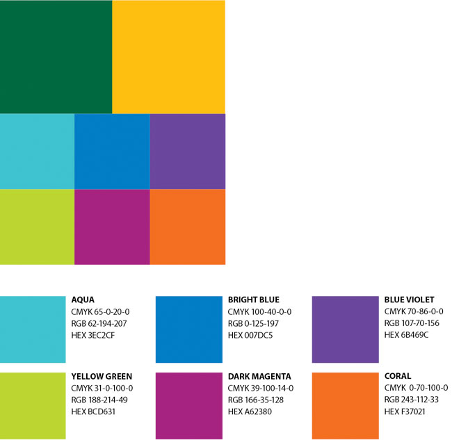
The colors in this palette are brighter, more vivid versions of the colors in the supporting palette. The tones were chosen because they convey energy, fun, and youthfulness. All work very well with either one of the primary colors.
This selection of colors is very active and energy oriented.
The colors in this palette would work well with projects that
- Are targeted toward a young audience (prospective students).
- Promote energetic campus events (Mason Day or Welcome Week activities).
- Reflect the personality or mission of the sending unit.
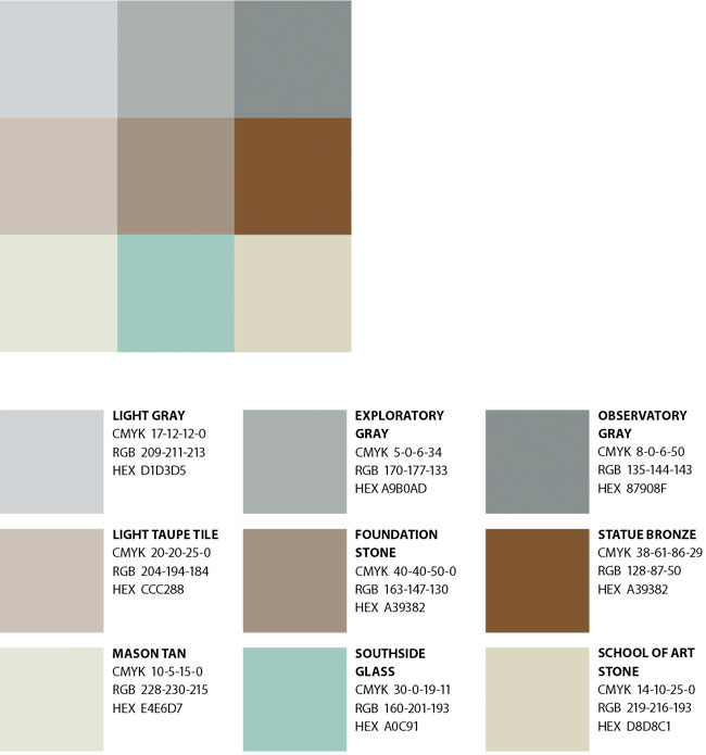
Secondary Palette: Neutral Tones
This neutral palette was developed to work with all of the other secondary palettes. This palette was drawn from the physical environment on campus. The colors reflect the steel elements of the newer buildings, as well as the natural stone, glass, and tile being used.
The colors in this palette can stand alone or be used to complement any of the other color palettes. Used alone, this palette could be effective for communications that need a quieter, more reflective, or thoughtful voice.
A neutral tone is also a great bridge to drop between two colors from one of the other palettes. Using two strong colors from one of the other palettes with a neutral gives you flexibility without color overload.
